For the love of type.
The Challenge
Help an animation studio find and express their brand identity with a website that shows off their unique mix of science-based animation and liberal arts design.
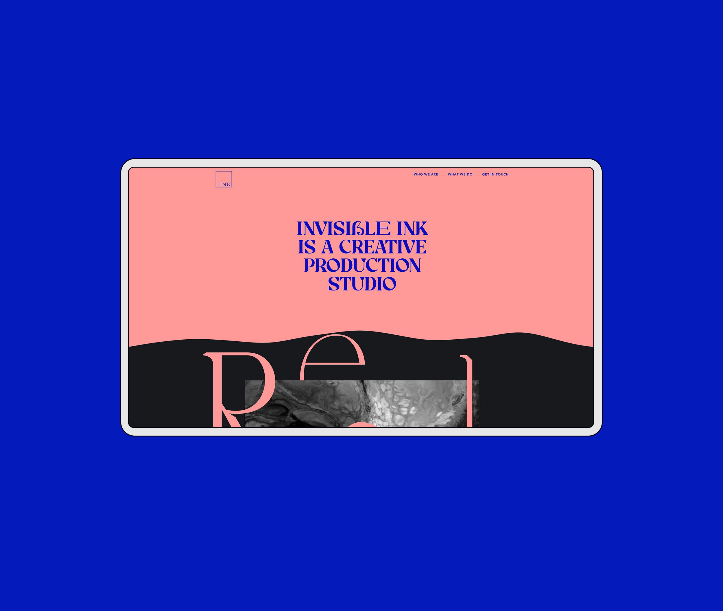

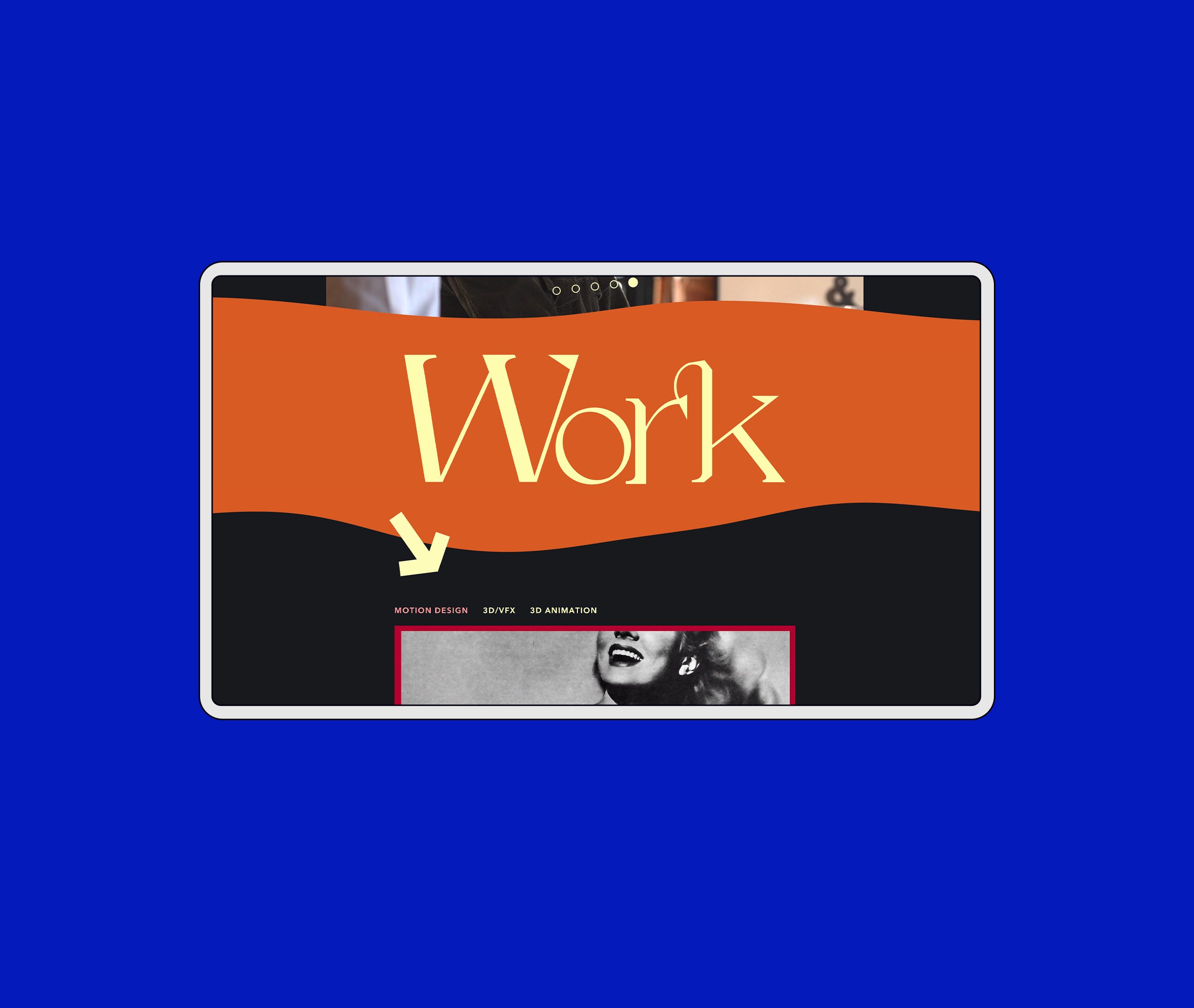
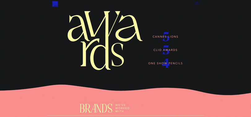
Invisible Ink loves color.
Colorful and professional design that uses typography to balance flowing curves with sharp lines. All website elements were designed to look good static, but also creates opportunities for their killer animation skills to shine.

Here’s us scrolling through the website.
Or, go at your own pace and click here.
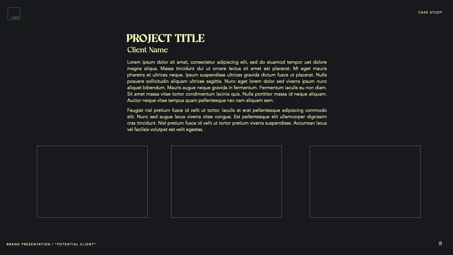
Marketing materials
Once Ink was happy with the look we created for their website, we designed a wide range of slides for them to use in future pitches + presentations.